Sunday, 26 September 2010

Planning for our Genre

We contemplated all of the possibilities of genres that we could do for our trailer and as a group decided upon the crime genre. We made a chart of all the possibilities and limited them down to our most favourite.


The possible genres that we chose were, horror, thriller, romance, rom-com, drama, psychological thriller and crime and gangster. After a lot of consideration, we chose crime and gangster as our genre as we believed that it is thoroughly different to everything else, media related, that we have done. Furthermore there are many possibilities with the storyline, so we can think of multiple plots for the main narrative and then adapt for our trailer. As we have decided upon the crime genre, i looked up the typical conventions to ensure that we create a realistic piece:

Criminal and gangster characters

Underworld figures

Highlight either the rise or fall of a particular criminal

Gangster films are often catagorised as film noirs

There is often drug abuse portrayed in the film

Violent props, such as guns, knifes etc

Car chases/ chases in general between groups that have rivalry

Friday, 24 September 2010

Sin City Trailer

Sin City Traler Analysis

Sin City Trailer Analysis

• The trailer begins, like the other trailers, with a distribution logo ‘Dimension Films’ and ‘Troublemaker Studios’. Troublemaker being relevant as founded by Robert Rodriguez and also director of Sin City.
• This leads to a cartoon image of one of the characters with the name ‘‘Marv’’. The picture is in black and white, following on to the same image of the real character which also has a black and white contrast too. The black and white imagery may reflect the idea of shadows, giving an eerie sense. The man is lighting a cigarette, which is conventional of how crime characters are portrayed. Additionally, the cartoon images may suggest an unrealistic edge to the film, this can relate to Baudrillard’s theory of simulacrum, where reality is blurred. The cartoon imagery is intertextual to the orientation of Frank Miller’s series of comics, and may also reference back to the poster where the characters are in squares, creating a comic like image where the stories lead on to one another.


• As the trailer builds up there is a non-diegetic, mysterious and slow music which also sounds action based. There are a few banging sounds which can connote guns.
• The shot of Marv dissolves to an image of a woman, where there is colour illustrated.
• There is then a quick, long shot of two police cars; the shot doesn’t look real, almost as though it’s a cartoon reflecting back to the narrative being unrealistic. The cars are outside, where we realise that it is night, this can connote crime as depicted in the dark so nobody can witness.
• There is then a flash to the ’Marv’ character, who is in a dark room, next to bright red bedding, he is looking at a character laying on a heart shaped bed , whilst holding her hand. As previously mentioned, the two colours of black and the red are iconographic of death.
• This is followed by an establishing/ crane shot of police-men running up some stairs, we get an insight into the character as we realise that he is a fugitive. Marv blows the police up, leaving the audience inquisitive toward the narrative.
• The shot then fades to black, and we meet the next character.
• The introduction of the character again begins with a cartoon image and with the name ‘’Hartigan’’ on the screen.
• The character walks through the doors into a pub, where we see a female dancing, it flashes to the man where there is a close up of him looking mysterious as he looks around indicating the crime aspect again. Additionally there is a voice over saying ‘’We need to get out of here’’ suggesting this further. The voice over sounds echoed, which almost gives a scary feel as it can reflect being unaccompanied.
• Next there is a cut to an introduction of a fierce looking character, ‘Dwight’, which dissolves to a mid shot of a man holding a gun.
• The shot fades to black where we see another mid shot of a female character, where the background is misty, connoting an eerie sense. The character looks innocent as she is wearing crosses that stand out. The character is small compared to the majority of the shot indicating her innocence further.


• The dissolve transition may indicate that the separate stories interlink with one another.
• There is a mid shot of the dependent looking girl, which zooms in to her face as the woman says ‘’helpless little girl’’ signifying her vulnerability further. Additionally, she looks younger than most of the other characters being portrayed, signifying her purity in comparison to them.
• There is a close up shot of a sword, which indicates further the significance of the weapons to the story.
• There is the indication to the rain again, which is a common motif within the ‘Sin City’ products that I have analysed highlighting a suppressive feel to the atmosphere. We see Marv again, where the camera slowly pans up him. The camera then cuts to a character holding a gun, which then quickly cuts up him, perhaps indicating that he is a distorted figure within the film. The camera focuses on his face for a while, with him looking directly at the camera, giving him a fierce and dominant persona.
• There is then a shot of a car, where we see the people in it; it zooms in to one character that is cut up, suggesting violence again.
• Following this there is a long shot of a group of people and a character facing them. At this point the voice over says ‘’Sometimes I miss killing a whole lot of people’’. The character is pointing a gun at another character. The majority of people in the shot appear to be men; however the one he is aiming at is a woman, this may signify the idea of women being defenceless in comparison to men. This is indicated further as there is another man touching her, either protecting her or additionally violating her, building to the sense that women are supposedly more vulnerable.
• There is a change in scene to a shot of a character shooting a car. There is a slow pan, with an extreme close up of the gun, suggesting its fundamental role within the film.
• There are two indications of relationships within the story, which may suggest some form of hold back, or help with the other characters. This again links to Propp’s idea of the majority of narratives including a relationship, or a ‘’prize’’.


• There is then a line up of shots containing the actors and their name. The writing is a similar font to the ‘Sin City’ sign at the end of the trailer. The writing is red, and looks abraded; some of the letters look as though they are gun shots. The deformation effect to the writing suggests a portentous indication to the film.
• There is then a few action shots, one where there is a female character, who throws a weapon, she is wearing dark clothing and has a leg showing, suggesting that she may be a seductive figure, like a lot of the other women, in the trailer, are indicated to be.
• There is a cartoon version of two characters previously shown in the trailer accumulating to the reflections of Miller’s comics. Additionally there is an unrealistic shot of a character with a yellow substance on his hand.
• There is some more indication of crime, when there is a long shot of a police car and a character jumping through the window. The only colour in the shot, that doesn’t have a black and white effect, is red; this is suggested a lot through the trailer, being representative of blood.
• There are some more shots of actors within the film that may appeal to some people.


• The trailer penultimately finishes with a low shot of a character, where the camera is looking up at him; the atmosphere looks foggy around him, which may connote a forbidding persona.
• The trailer ends with a crane shot which pans around an illuminated city; the lighted buildings can suggest a range of people, highlighting the different stories. ‘Sin City’ transmutes from the city, with red lines down the screen, which looks like blood. The ‘Sin City’ title then turns to red and ‘Coming Soon’ emerges on the iconic raining background


Tuesday, 21 September 2010

Sin City Poster Analysis

Sin City Magazine Analysis


  • The characters on the magazine look as though they are all in different situations, such as the fact that they are all in different positions and looking in different ways, indicating that there is a thriller sense, as the storyline may be difficult to follow. Additionally the fact that they are all holding weapons suggests that the genre of the film may also be crime/action.
  • The characters have been individually placed on the magazine, this may indicate that there is more than one story to follow. This could be seen as a postmodern element as, like Pulp Fiction, it includes the connotations of a non linear narrative, which is messing with the conventions of film.
  • The pathetic fallacy of the rain in the background builds up an oppressive and foreboding feel to the storyline. This is also portrayed with the low key lighting and little ambient light shown.
  • All of the characters are wearing black, this may suggest that they are hiding from something or someone. All the men seem to be covered up whereas the women have some body showing, suggesting that they are more vulnerable characters, this is a typical stereotype that is indicated.
  • At the bottom of the magazine, there is a film strip with a range of different movies on, this may attract the audience to buy the magazine if they like the other films. This seems even more so as the films being portrayed on the front cover are all mainly the same genre of action, such as 'Sin City', 'Batman' and 'Spiderman'.
  • The tag line indicates what is included inside the magazine, ''The best movie news, reviews, interviews and DVD''. To ensure that our product is realistic, we should ensure that we do something similar to follow the conventions of real media products. Again with the price,date and barcode added.
  • The 'Sin City' title contrasts with the dark background, making the film being depicted clear.
  • Above the title of Sin City, 'Bruce Willis' is printed, attracting people to watch the film and additionally buy the magazine as he is a well known actor.


Kill Bill Trailer Analysis

Link to the video: http://www.youtube.com/watch?v=AjDKhqW5vGg&feature=related


The trailer begins with the distribution logo, Miramax.

There is a shot of a plane which then fades to black. The non-diegetic, music begins, which is based upon an upbeat record, this may indicate the genre of action.

The next few shots contain text which is yellow, an iconic colour to the film as it is portrayed a lot throughout, such as 'The Bride's' outfit. The writing presents the film, by promoting that it is a ‘’Quentin Tarantino’’ production and that it is his fourth film, fading to black.

There is a shot of somebody vigorously opening a car boot. The person is disguised as they are wearing a helmet- The mystery figure may relate to the crime genre as the character is hiding their identity. The shot then fades to black leading to the next shot of a gang of people slowly walking with weapons, this signifies a danger element.


Next there is a mid shot of the character riding a motorbike. So far in the trailer, there has been a few modes of transport, suggesting that people are coming together, or indicating that the storyline is based upon people fleeing.

We then see a long shot of the gang of people in long overalls walking through a crowded room. This shot then changes to a quick pan across to the character in yellow. The helmet has been removed which at this point, we realise that the character is a woman. This goes against stereotypical conventions as it may be seen as unfeminine to ride a motor bike. This is defeated however with her long hair making her seem feminine and, although the clothing is masculine, it is tight and can be seen as seductive.

The camera slowly zooms in as the bride turns around. After turning, the music ends from the build up to a more fast pace non-diegetic music. The change in music may connote the discovery of the character and her significance to the storyline.

There is then a shot of the yellow text on the black background, implying who the actor is, ‘’Uma Thurman’’.

This is followed by several shots of swords, one of them being an extreme close up, referencing that it is an important prop to the film. Meanwhile, there is diegetic sound of the people fighting.


There is a shot of Lucy and ‘The Bride’ outside, where it is snowing, the atmosphere and the scenery almost looks fake, which inflicts its postmodern elements of it being unrealistic and can add a humorous effect to it.

This is followed with a shot of a man practicing with a sword in a dark, compact room, adding to the violence. It also juxtaposes with the previous shot where the characters are fighting outside, initiating the idea that the film is packed with action.

There is a close up reaction shot of the bride, where her appearance looks disarrayed as she has a cut on her face and her hair is messy. She stares away from the camera, with an anxious expression, connoting that she has been fighting.


The trailer then cuts through a variety of actors in the film, which are transitioned to a negative contrast. This creates synergy as the same images are shown on the poster. The negative colours also make the film look unreal, again referencing to postmodern facets, as suggested, that films are becoming less realistic.

There is then some more action followed with an extreme close up of the brides eyes as she is looking around, this again makes her seem as though she is cautious as it appears she is looking for someone.

The non-diegetic music then slows down as the camera zooms up the woman, and emerges to a crane shot, where there are people crowded round her in black- the black clothing refers to a disguise again indicating the crime genre. The camera being above the character may suggest that she is inferior as it is positioned looking down at her. Additionally she is standing on glass, that is easily breakable, highlighting that she is the least dominant. This image is soon subverted, when there is a mid shot of her face with a determined expression where she pulls her sword up highlighting her confidence as the people fear away. The sword is pulled up across her body connoting that she is protected.


In between the next few shots of action, there is more text implying the release date. The text is on just long enough to read, the action shots are quick, suggesting that she two, is fast at fighting, which is also implied as there is a quick shot of her jumping across the camera. Furthermore, the prompt camera movement, from shot to shot suggest the action side to the film.

To finish the trailer off, there is dialogue between The Bride and Lucy, They are the main focus of the shot, whilst there is a blurred depth of field suggesting that they are important .


Monday, 20 September 2010

Kill Bill Poster Analysis


The character's are in a thin strip which may connote the theme of swords.
The 'Kill Bill' title also has a line through it indicating a knife theme again.
The colours are like the magazine, which has iconographic colours of death, black and red. The yellow colour behind the characters reference to 'The Bride's' outfit.
There is the noticeable name of Quentin Tarantino, which may attract people if they like his films.
The date of release is at the top of the poster, ''This October, Go for The Kill'' which is ambiguous and leaves the audience intrigued and references to the synopsis and also the title of the film.
The Bride is holding a sword across the other characters on the poster indicating that she is superior over them and maybe suggesting that she has killed them. Furthermore, she is higher than all of them, which again signifies this.
The title looks distorted, and almost faded indicating a portentous feel toward the people, or to the storyline, this may refer back to Propp, who suggests a struggle. Also, the fact that there are other characters portrayed on the poster, who also have weapons, may signify that there is a complication, again relating to Propp.
The Bride is the only character on the poster who is looking directly at the audience, this suggests her significance to the film.
The characters are in a black and white contrast which gives the characters almost an evil edge as they have illuminated faces and dark hair.


Kill Bill Magazine


  • The magazine cover is similar to the DVD case, in the way that ‘The Bride’ is holding a sword, creating synergy. The sword may suggest that she is protected indicating her dominant persona.
  • ‘The Bride’ is standing in the middle of the page and almost as tall as the page, suggesting that she is significant.
  • The character is wearing yellow, making her stand out, particularly with the white background, which looks plain but highlighted with the outfit brightening the front cover and making her look confident.
  • There is blood through the title, which looks like a sword has gone through it, indicating a reference to the synopsis.
  • There is also blood located around the front cover, signifying parts of the storyline.
  • The colours of the title are black and red which are iconographic colours of death.
  • The woman is looking down slightly, signifying that she is dominant; this is also signified as she is dressed provocatively, accumulating the idea that she is superior, such as her top being slightly undone, and tight clothing.
  • The names of the actors are highlighted in red above the title of the film which may entice people in if they are familiar with the actors.
  • The sword and the costume indicates the action genre.
  • 'The Bride’s' facial expression is blank and is looking straight at the audience indicating a serious and inquisitive sense.
  • The character's posture looks laid back, as one arm is behind her back making her seem as though she is slouching. She also looks ready for action as her other arm is in front of her body with the sword, and her stance makes it seem as though she is about to move.
  • I have notified permeable conventions of magazines and have figured these main features:
  1. Bold masthead- The 'Empire' logo is a recognizable symbol. It is tall and bold, The red is a bright colour that can be noticed.
  2. Subtitles/slogan – ''It's bloody genius! And we've got the full gory story!''. This is a catchy slogan and will draw people in, if they want to check the story line before watching the film.
  3. Something to draw the audience in- For example ''196 pages'' or fifty top movie moments.
  4. USP(Unique Selling Points) – such as in this case the free gift ''The UK's best DVD mag free inside'

Friday, 17 September 2010

Shaun Of The Dead Trailer

Shaun of the Dead Trailer Analysis

• From just the title and the first few seconds of the trailer, there is an obvious pastiche of ‘Dawn of the Dead’ signifying the film’s postmodern elements. Additionaly there is not much reality being portrayed, this depicts Baudrillard’s theory of hyperreality- particularly with the idea of zombies.

• The trailer begins with a serious edge to it, with a voice over and quick flashes of news reporters. There is diegetic sound of the reporters talking and a high pitched sound in the background, making it seem horror like.


• In between the news reporters there are quick long shots of the zombies and some of people giving an insight to the narrative.

• There is use of depth of field with an image of an ambulance from the inside of car; the car obstructing the view may suggest a sense of safety.

• When we meet the two characters, we realise the genre is also a comedy as they react to the zombie in a humerous way. This is a mid shot with a slow zoom focusing on them.


  • The zombie shot maybe implicates Levi’s Binary opposition theory, where there is a clear shot of the door, juxtaposed with the next shot where it is of Ed and Shaun, in the house fearing back. This indicates freedom and entrapment.

    • This is followed with a range of quick shots, the quick shots can connote action.

    • There is then a reaction shot of Shaun and his girlfriend which zooms in to their faces at the point when Ed’s phone rings indicating the comedy side, the colour lightens and darkens, which appears to happen in quite a few shots, where it almost looks as if it is a camera flash, this may connote they are under watch, hence the zombies.

    • The rule of three is then indicated when Ed and Shaun are looking through the records, the zombies in the foreground, and them in the background of the frame and scenery in the background.

    • This trailer relates to Vladmir Propp’s character type theory, where there is the villain, the zombies, the hero, which is Shaun, and his helper being Ed. Shaun is particularly indicated as the hero in this trailer, when there is a low shot, where he is tall over the camera position, indicating his superiority, furthermore there are a few tracking/ action shots of him killing the zombies.


• The trailer is in a non linear format, this is indicated with the different shot types and different scenes continued with another shot breaking them up.

• There is shot of Shaun looking out of a letter box, which again indicates entrapment.


• There are reaction shots of the characters involved in problems, indicating, Propp’s function theory of there being a ‘’complication’’ in the story line.

• The end of the trailer signifies the comedy aspect again, where there is a change in the action music, to more uplifting music, which is also intertextual as the music is also in the film.

• There is then a black background with the ‘Shaun of the Dead’ title in a distorted font followed by ‘coming soon’.

• At the bottom of the shot, there’s then the distribution signs and logos, which we must ensure to add to our trailer as it gives it a veri-similitude edge.

Poster Analysis

• Shaun is the furthest forward and tallest indicating that he is superior.

• The red and black are iconographic of death.

• Shaun Ed and Liz are in the middle, with the zombies around the outside, suggesting their significance, or that they are trapped.

• The title stands out and looks distorted, it is the same as on the trailer creating synergy.

• The names of the actors are at the bottom, influencing people to watch if they like the actors.

• There is a quote at the bottom, encouraging people to watch as it suggests that it is a likable film.

• Shaun is holding flowers, referencing the romantic side, they’re all holding weapons, this may link with Propp’s functions of media texts, where there is a romantic side, where the hero gets a prize, being Liz.

• The clothes that the characters are wearing signifies that they are ordinary people, such as Shaun wearing work clothing and Liz and Ed wearing casual clothes.

• There is an indication to the genre at the top of the poster, ’A Romantic Comedy. With Zombies.’

• At the bottom there is a pun, saying ’This September, aim for the head’ signifying the narrative of defeating zombies, and also, suggesting that the film will be the ‘’head’’ of the cinemas.

• There are distribution logos at the bottom such as ‘’Rogue’’ being a distribution and production company.

• The actors names are at the bottom of the poster, luring people in if they recognise the names.


Thursday, 16 September 2010

Postmodernism

Postmodernism

Postmodernism is a fairly new concept that emerged around the mid 80s. The concept can be based upon a range of areas, such as art, music, film, literature, sociology, communications, fashion and technology.

Theorist, Baudrillard, suggests that what we see on the telly is only one version of the event, and the version of the story that we choose, is our winning story. For example, September the 11th, for the majority of people, was only witnessed on the television; therefore, we only believe what we have seen on the telly, without witnessing the trueness of the event. Baudrillard calls this concept hyperreality or simulacrum, which is the inability to distinguish realty from the media, or it’s replacing image. Another example of this would be in ‘The Matrix’ where there are two worlds, the one that appears real, is in fact the fake one, making people question what’s real. Additionally, ‘Pulp Fiction’ is considered a postmodernist film as it messes with the conventions of modern films. The non linear narrative is not traditional and furthermore it is difficult to distinguish the actual genre of the film as the conventions vary. Postmodernists tend to go against normal conventions by using intertextuality and making pastiches, where they play around with the concept of hyperreality and break the rules of realism. For example in ’ Pulp Fiction’, there is intertextuality when Butch is choosing a weapon, linking to ‘Texas Chainsaw Massacre’.

Wednesday, 15 September 2010

Goodwin's Theory

Goodwin created a narrative theory from looking at media products. Although he focused on music videos, we can adapt and try to relate it to our trailer. He concluded with eight main stages of narrative, these are:

1/ A relationship between the lyrics and visuals

2/A link between music and visuals, either indicating the title or contradicting it with the lyrics

3/Genre characteristics, the characteristics are portrayed when the genre is identified- for our trailer, we should be thinking of the conventions of our chosen genre

4/Intertextual reference, we could be thinking about including other texts being portrayed in our production

5/Notions of looking, such as male gaze, often women are looked upon asif objects

6/Voyeurism, direct gaze, looking at artist and insights to their life

7/Demands of the record label, in our case a trademark reflecting our trailer

8/Performance based/ narrative, this can relate to our trailer, whether it's from a linear perspective or fragmented

Vladmir Propp


Vladmir Propp analysed over one hundred folk tales, in which, interpretating eight different character types. This is useful to identify characters in media productions and realising their role.
1/ The Villain


2/ The donor (preparing the hero, by giving an object or significant information)


3/ Helper (Helps somewhere on the quest)


4/ Princess or prize ( quite often received by the hero, or maybe the victim)


5/ Her father ( Who ives the task to the hero in the first place, or identifies hero)


6/ The dispatcher


7/Hero


8/False hero

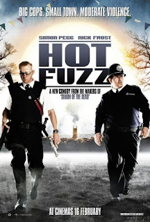
This is useful today as this theory can be noticed in recent productions. An example of where this can be identified is in Hot Fuzz, where there is a hero, Nicholas Angel, who distinguises the cause of the high death rate. The villains appear to be a high majority of the local people living in
Sandford. The helper can be seen as Danny Butterman, who enthusiastically
helps PC Angel.


Vladmir Propp also developed a theory on narrative functions of texts. This includes:

  • Preparation
  • Complication
  • Transference
  • Struggle
  • Return
  • Recognition

These functions can relate to many media products and can be recognised within different films.

Levi Strauss, Binary Oppositions

Levi Strauss

Strauss proposes the theory of binary oppositions which we can relate to many texts, this may be useful when constructing our own trailer as we can develop similar ideas. Binary opposites are the differences between two groups, such as young and old, entrapment and escapism, good and evil etc. There is quite often a mockery toward one of the oppositions, such as black and white - black most often portrayed as the inferior group, whilst the white opposition overpowering them. An example of young Vs old would be Levis ''Pool Hall'' advert:

Introduction

We have decided to produce a trailer for the beginning of a film; this will also include ancillary products, being a magazine and a poster. In order to understand the conventions and produce a realistic set, i will be analysing different trailers. I have resulted in researching different genres, because we have only recently decided to create a trailer, therefore we have not yet decided on a specific genre.